TransitMatters Releases New ‘Data Dashboard’
TransitMatters, the transit advocacy organization, has launched an updated version of its Data Dashboard, a valuable report card of MBTA’s service levels, slow zones, and ridership.
“These metrics are crucial, high-level indicators of system health,” wrote Dani Caisse, the TransitMatters Social Media Manager, in a press announcement.
StreetsblogMASS and other news outlets regularly use the TransitMatters dashboards to report on MBTA service levels and travel times.
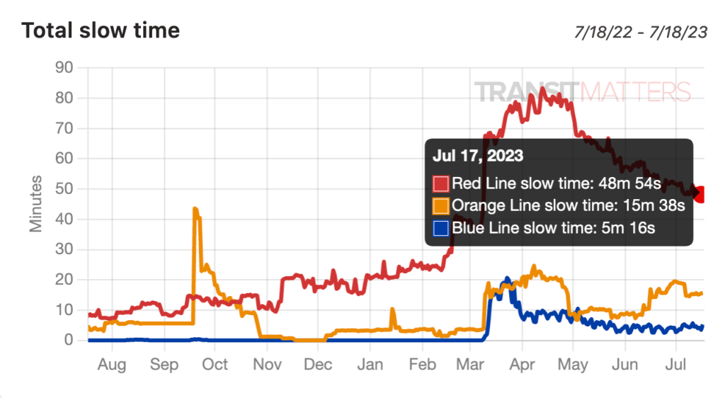
For instance, the Dashboard’s real-time data offers an opportunity to pinpoint various slow zones across the system. It also offers an interesting look at how fare-free service on the 28 bus, which started in September 2021, affected bus ridership in Mattapan and Dorchester.
TransitMatters compiles speed and service level data for the four rapid transit lines and several key bus routes from the MBTA’s open-source bus and train location data.
Ridership data comes from MassDOT reports that are based on how many riders tap their Charliecards at stations.
Note that the TransitMatters ridership numbers are lower than the numbers in official MBTA reports. That’s because a considerable number of subway riders transfer between lines without passing through two fare gates, and many Green Line stations do not have gates at all.
Read more about the new Dashboard’s features on the TransitMatters blog. They’re also hosting an “Ask Me Anything” session about the new website this morning on Reddit.
Streetsblog has migrated to a new comment system. New commenters can register directly in the comments section of any article. Returning commenters: your previous comments and display name have been preserved, but you'll need to reclaim your account by clicking "Forgot your password?" on the sign-in form, entering your email, and following the verification link to set a new password — this is required because passwords could not be carried over during the migration. For questions, contact tips@streetsblog.org.