Close.City Maps Illustrate Inequalities of Access to Vital Services Across the Boston Region
On Friday April 5th, Nat Henry (@NatMakesMaps), Director and founder of Henry Spatial Analysis, launched “Close”, an interactive map that shows walkable, bikeable, and transit-friendly neighborhoods across every block in the United States.
Henry Spatial Analysis is a Seattle-based geography consulting firm with a focus on health and urban sustainability that started last summer.
The Close map shows any given city or county and its neighborhoods’ proximity to essential services, namely supermarkets, libraries, public transit stops, parks, public schools, convenience stores, farmers markets, restaurants, coffee shops, pharmacies, and other destinations..
You can toggle the map to show your ability to access these spaces either by walking, biking, or walking and transit. The map will show how long it will take to reach these amenities and by which form of transportation you select through colors: the darker blue an area is, the closer it is (under 5 minutes), and the darker red it is, the further it is (25-30 minutes). You can even go deeper in selecting any given block that will approximate the commute time to the nearest library or supermarket.
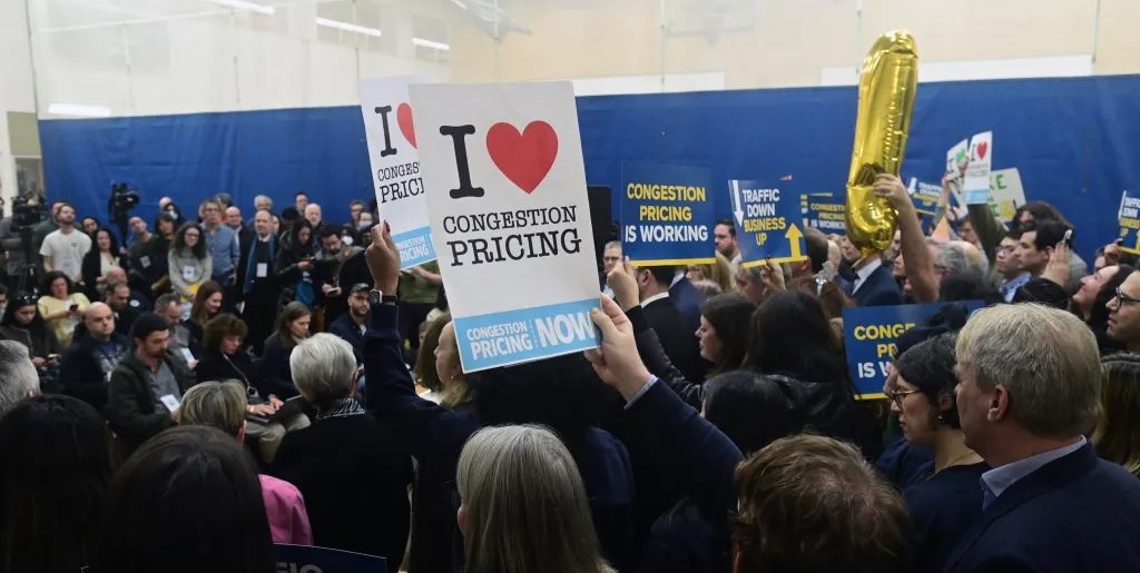
Twitter/X users have been exploring the map since it launched, sharing their excitement and celebrating, or expressing frustrations and calling their community in, regarding their city’s representation and accessibility.
Accessing this map and being able to discuss, think critically, draw conclusions, and advocate on behalf of where we live and how we get around safely has opened up discourse about how housing policy, zoning, and access to transit impacts all of us across Massachusetts.
Some people celebrate the work that is being done in cities like Somerville and Cambridge, while others decry how the area around Tufts University in Medford resembles food desert conditions, or how residents of Boston’s Black neighborhoods of Roxbury, Mattapan, and Dorchester have been zoned to the fringes of the city in areas where many pharmacies have been steadily closing down, inequitably depriving people of access to critical medical services and essential prescriptions.
There is, of course, the added layer of who can afford to live where. There is a critical conversation that cannot be separated from this data regarding how people of color who once lived in city centers have been priced out of their areas, and by default, priced out of a lifestyle of accessibility and overall wellbeing.
This map has furthered discourse surrounding the idea of a “15 minute city”, or a city where daily essential services and amenities are no more than 15 minutes away. Potentially, access to this public knowledge will lead to more efforts to push elected officials to zone in an accessible and inclusive way, with safe modes of travel for all.
I, of course, had to check out what this looks like in Malden and Boston – seeing the spaces where I have lived, gone to school, spent time with friends and seeing the day-to-day impact of planning and policy and how it has and continues to shape my life.
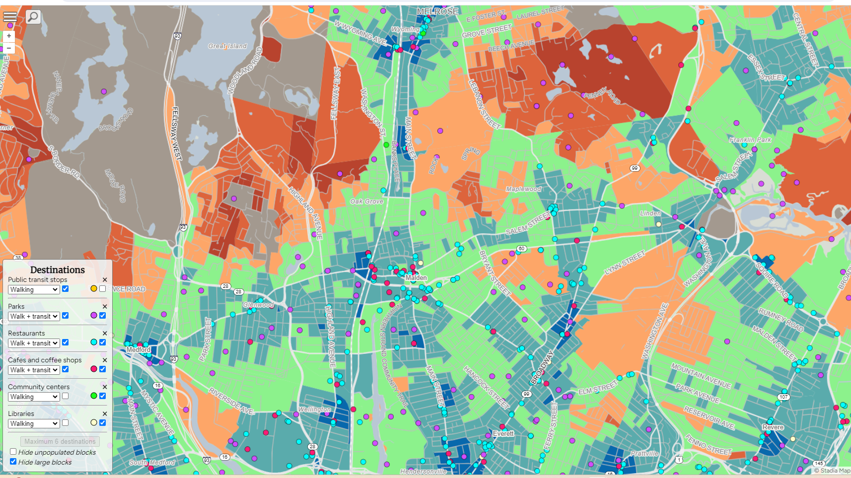
To me, the story of the Malden map that Close portrays is pretty accurate. There are many parks, there is accessibility in transit by way of the bus routes that run across the city, and there are diverse, delicious restaurants and coffee shops in almost every neighborhood.
But on that same note, the only train stops are on the west side (the Orange Line stops at Malden Center and Oak Grove) which can be an almost 20 minute bus ride or hour walk coming from the other side of town.
Revitalization efforts that have added luxury apartment buildings, Starbucks (in a historically Dunkin’-heavy area, no less), new chain restaurants, and activities like glow-in-the-dark mini golf, rock climbing, and escape rooms have all been concentrated in the downtown strip, a mere minutes walk from the Malden Center station.
I did not see the city’s joint-Senior and Teen Center depicted on the map, which I was able to easily flag for the developers.
And in terms of walkability, while the map does technically approximate the walking distance to the destinations I’ve indicated on the map like restaurants and parks, it does not reflect the quality of said walk.
For example, while the trip down Commercial Street and Rivers Edge Drive towards Wellington Circle is technically walkable with proximity to parks and transit, those streets only have a narrow sidewalk on one side, next to a multi-lane road full of cars speeding off of Revere Beach Parkway.
That sidewalk, in turn, runs alongside luxury apartments which obscure the riverside green spaces that lie behind them.
But given how I have lived here and can do some of these walks and bike routes with my eyes closed (I do not recommend), I wanted to explore other cities I don’t know as well, too. I also looked at cities that I have visited but don’t know as well, like Chicago, San Diego, and Charleston, to assess how residents and visitors experience the area.
Give Close.city a try today!
See an inconsistency or something that doesn’t quite match up to what you see and experience in your neighborhood? For example, Close still shows several known shuttered Walgreens stores in Roxbury, suggesting that there is more access than there really is. The developers are receiving corrections at hello@henryspatialanalysis.com or through this form, and will reflect those changes to produce an accurate map of your area.
What does your neighborhood look like? What do you think is needed to move the needle towards your own 15-minute city? Are there any cities that aren’t your own that you find inspiring (for better or for worse)? Leave your thoughts and reflections in the comments!

Streetsblog has migrated to a new comment system. New commenters can register directly in the comments section of any article. Returning commenters: your previous comments and display name have been preserved, but you'll need to reclaim your account by clicking "Forgot your password?" on the sign-in form, entering your email, and following the verification link to set a new password — this is required because passwords could not be carried over during the migration. For questions, contact tips@streetsblog.org.