TransitMatters Releases ‘Data Dashboard’ to Visualize T Delays
TransitMatters, the Boston-based transit advocacy organization, has published a new website to publicize and visualize delays and travel time data for the MBTA’s four rapid transit lines.
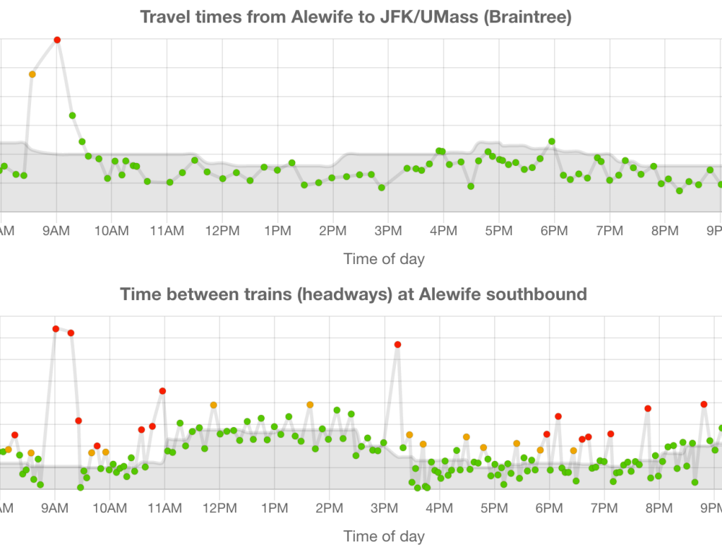
The website, at dashboard.transitmatters.org, parses data from the MBTA’s performance API, and plots daily travel times and delays on customizable charts.
The data are presented alongside the MBTA’s own service targets for travel times and headways – the time that elapses between the departure of the last train and the arrival of the next – to illustrate how well the T is meeting its benchmarks for reliability.
The T offers its own “performance dashboard” that offers on-time reliability statistics for subway lines, but TransitMatters notes that the T’s website summarizes performance for an entire day, and omits details about the duration of delays to specific trains over the course of a day.
To make a specific example: the T’s dashboard reports that Orange Line trains were 91 percent reliable on August 6. But the new TransitMatters dashboard reveals that every northbound Orange Line train exceeded the T’s target for a 40- to 43-minute trip time between Forest Hills and Oak Grove stations that day, and furthermore, dozens of trains exceeded those benchmarks by 25 percent or longer (southbound trains, on the other hand, generally did meet the T’s target travel times that day).
In an introductory blog post accompanying the new site, its creators expressed hopes that the data will “influence short term and operational decisions” and help the organization “more effectively keep tabs on the T operational performance and capital delivery projects.”
TransitMatters has also published the source code for the project on Github, so that other developers can potentially adapt the code, query data from other transit services, or build new data visualizations.
This story was corrected on Wednesday August 12. A previous version incorrectly stated that the new dashboard references data from the MBTA’s real-time vehicle location API. In fact, the dashboard references data from a separate API, the “MBTA-performance” API.

Read More:
Streetsblog has migrated to a new comment system. New commenters can register directly in the comments section of any article. Returning commenters: your previous comments and display name have been preserved, but you'll need to reclaim your account by clicking "Forgot your password?" on the sign-in form, entering your email, and following the verification link to set a new password — this is required because passwords could not be carried over during the migration. For questions, contact tips@streetsblog.org.